Misc. Work


Student Council Social Representative, Emily Carr Secondary School
June 2022 - June 2023
Duties varied heavily for this position. The primary job was to create social media posts to promote the student council and the school, and other related work involving designing artefacts. I assisted in creating decorations for the school’s semi-formal, and I designed, produced, and printed name tags for each table. Aside from these duties, I also frequently assisted other members with their own duties, worked tables for various events, and logged meeting minutes for council meetings.
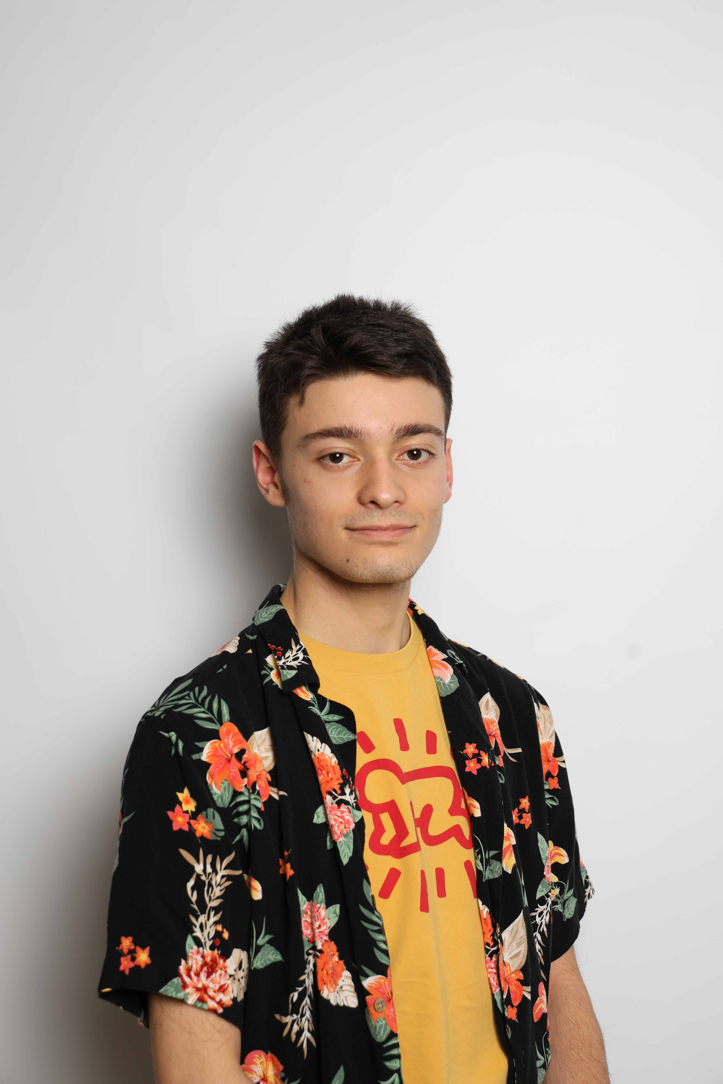
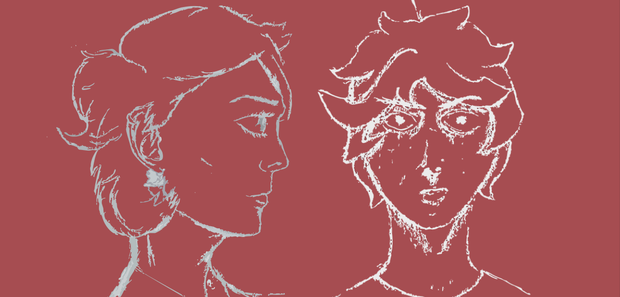
Who’s This Guy?
Unsound 2026 Promo Campaign
September - December 2025
Brief
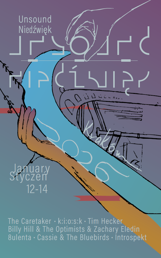
The aim of this project was to pick or create a festival and design the entire surrounding promotional campaign around it. The project was split into three parts; getting the general theme and feel for the aesthetics of the festival and providing a poster, designing merchandise and promotional material, and a third part which in my case consisted of designing a website for the festival to be hosted from.
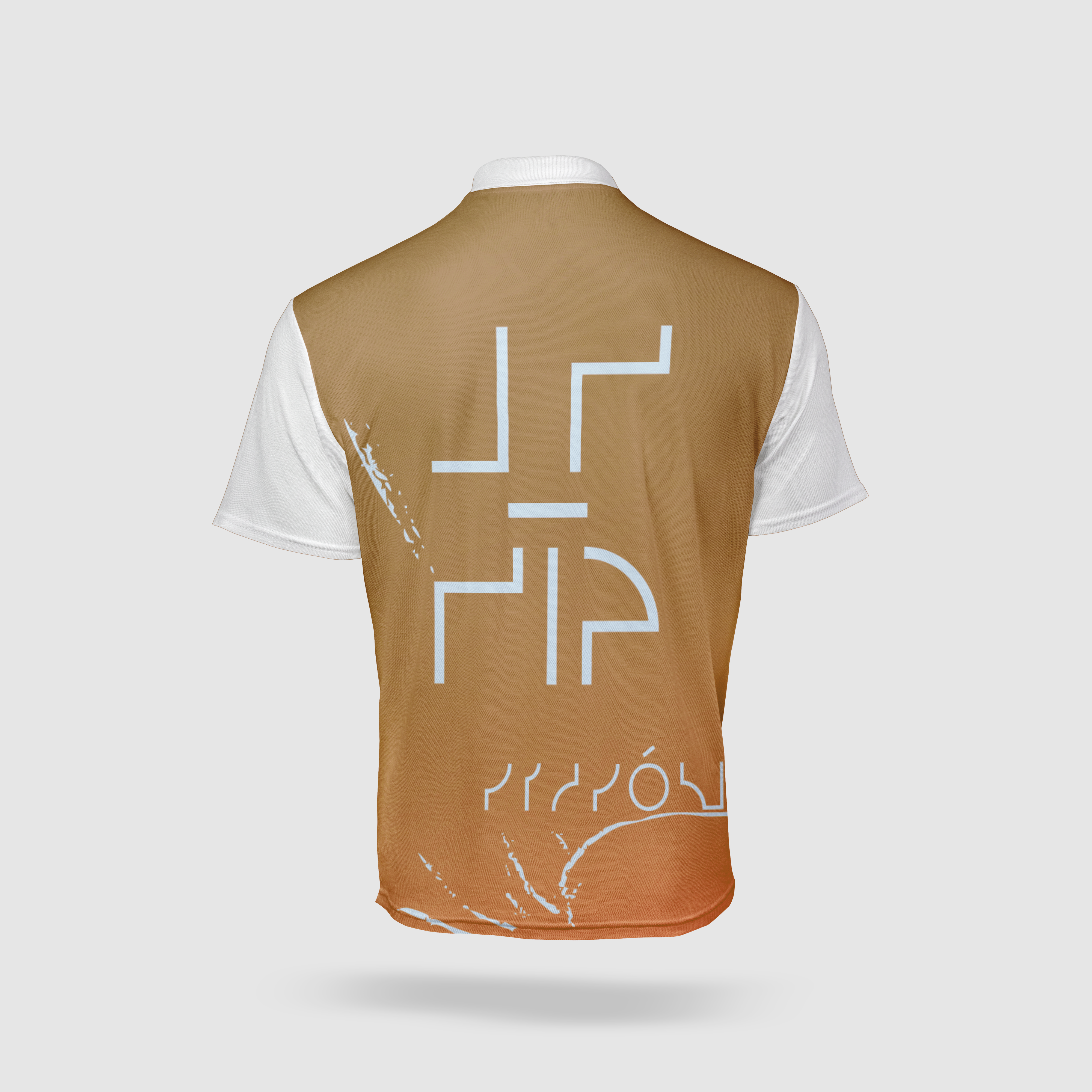
The poster had to be bilingual, and since the Unsound festival which I decided to choose was based in Poland, I used polish for the second language. I took inspiration from the work of other polish designers, and the gritty, industrial style that is present in the music of the festival. Unsound embraces the odd, the abstract, and the unconventional, which I aimed to portray with the visual design scheme, heavily based around a mix of sleek, futuristic fonts and scratchy hand-drawn elements and type.
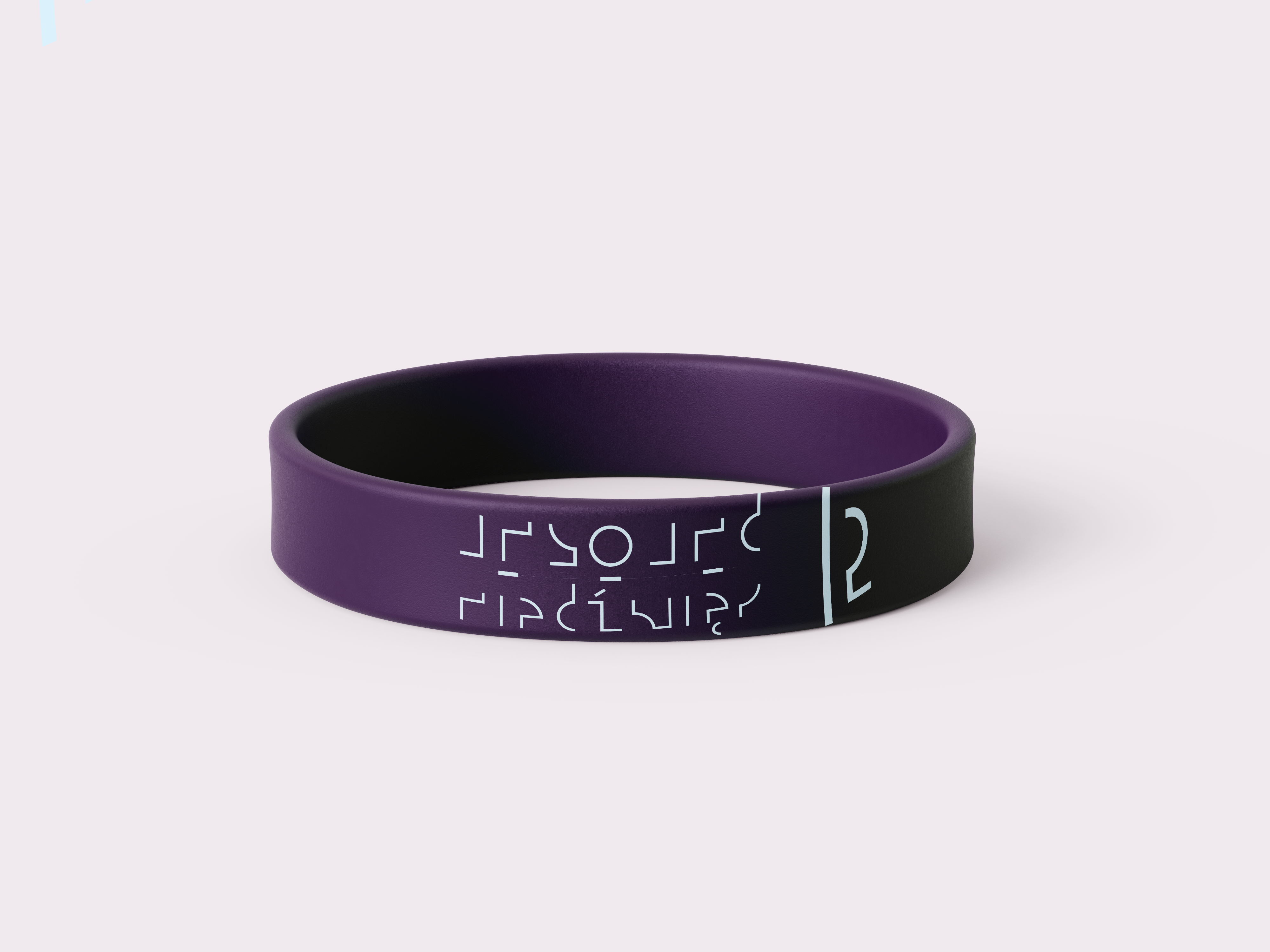
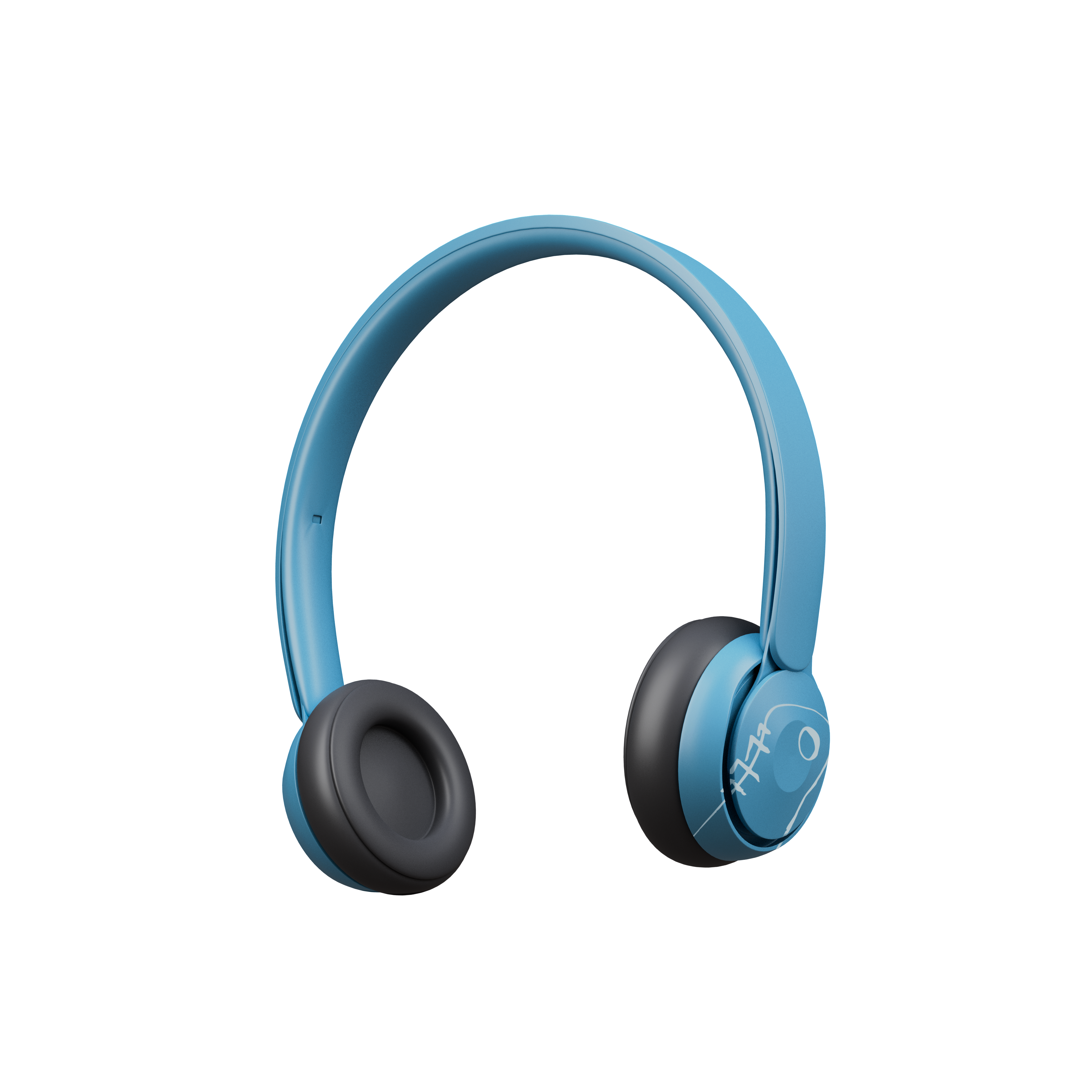
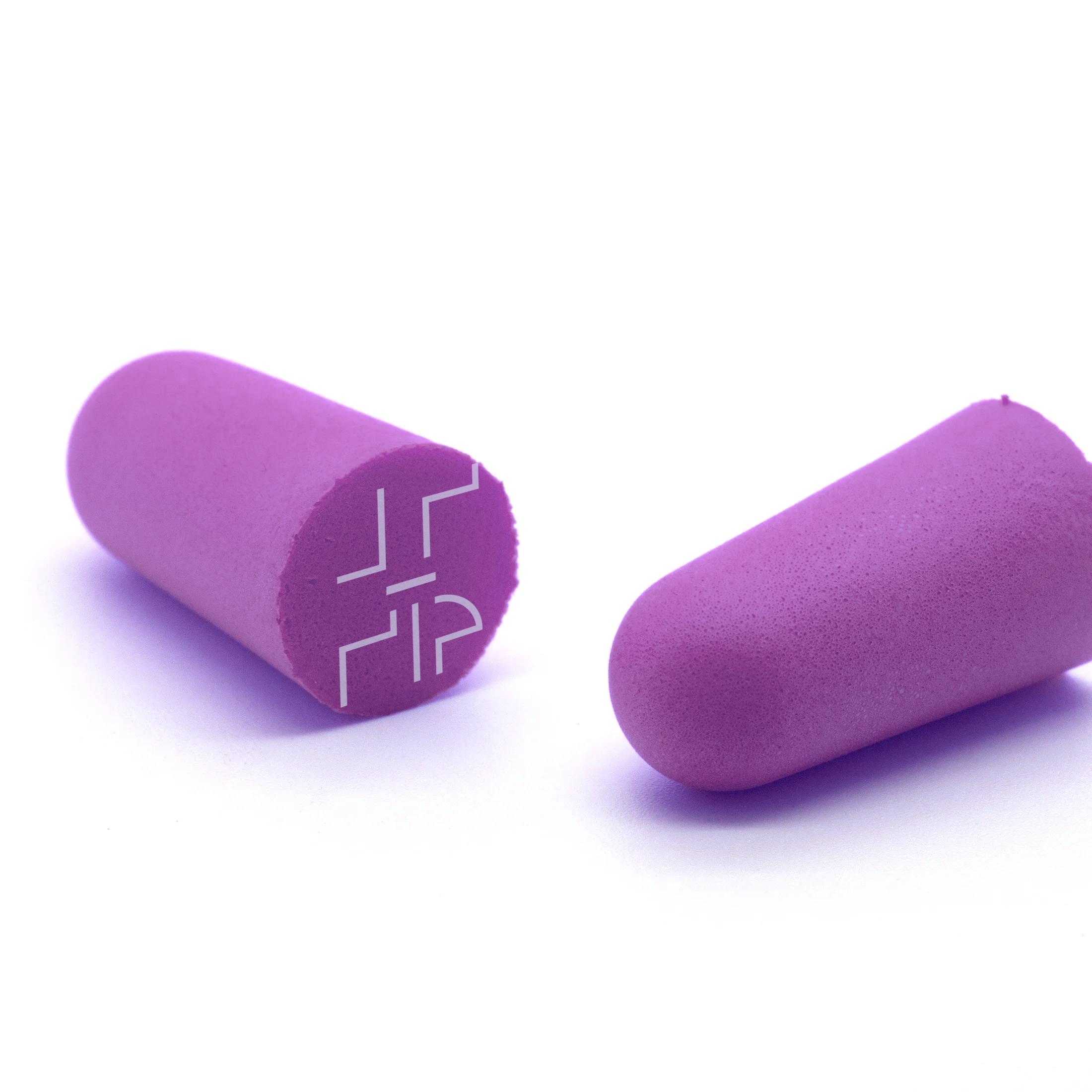
I produced a variety of mockups for this project, primarily consisting of wearable products. Some of the biggest ideas I had for these products were headphones and earbuds, both of which would be useful and relevant for a music event. Earbuds specifically seemed to resonate with a lot of people, seeing as they are essential to avoid hearing damage at concerts, especially louder ones like at this festival. I also produced wristbands and passes.
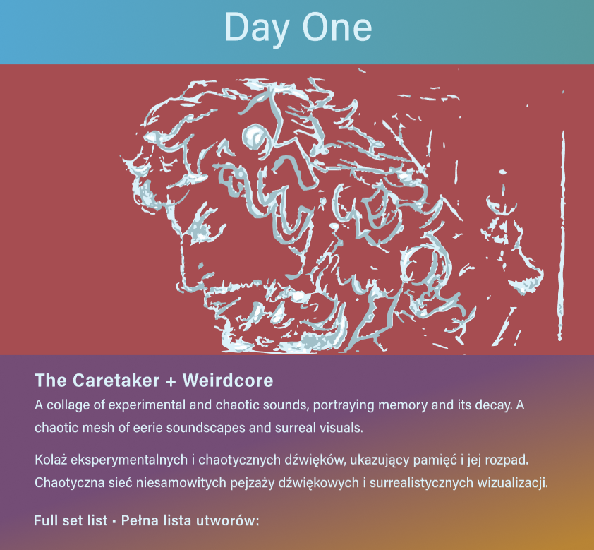
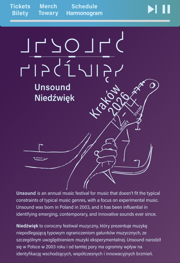
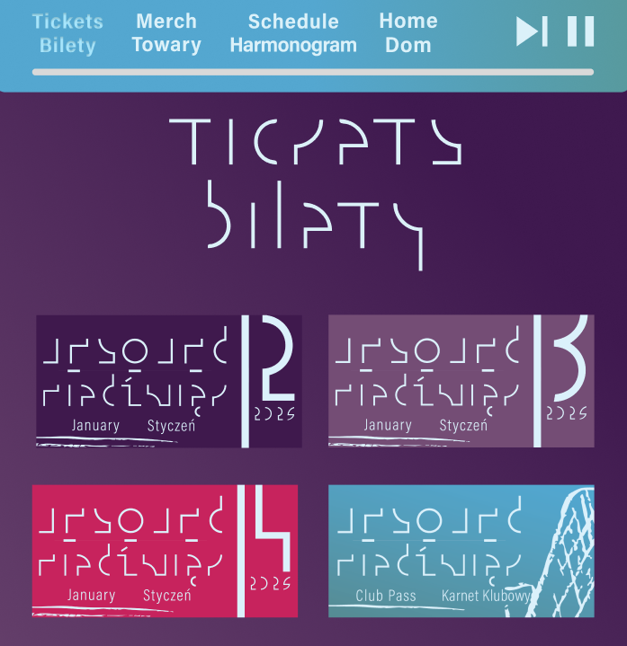
The final portion of this project involved producing a website, which brought together elements from the merchandise creation process, as well as the poster. I made heavy use of the illustrated texture present in the poster, and used it as a motif throughout the website for all of its assets. The mix of the sketched style and the detailed lines and smooth curves made for an interesting mesh of textures for the website.
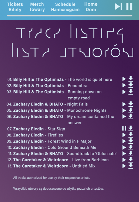
Something you may notice aside from the bilingual text is that there is a play and skip bar at the top. This is because the website has a soundtrack, pictured in the track listing shown to the left. The idea was to have a soundscape that plays while the viewers browse the website. The music is mostly produced by myself, and the soundtrack is primarily consisted of spacey, ambient music which emphasizes the mellow and spacey feel of the site. For more information about the tracks shown, see the Audio Work page.
Shown below is a demo of the web page with volume included. Please disregard the compressed quality.

Design Case Study #2
Design Case Study #3
Design Case Study #1

Resume


Student Council Social Representative, Emily Carr Secondary School
June 2022 - June 2023
Duties varied heavily for this position. The primary job was to create social media posts to promote the student council and the school, and other related work involving designing artefacts. I assisted in creating decorations for the school’s semi-formal, and I designed, produced, and printed name tags for each table. Aside from these duties, I also frequently assisted other members with their own duties, worked tables for various events, and logged meeting minutes for council meetings.
Unsound 2026 Promo Campaign
September - December 2025
Brief
The aim of this project was to pick or create a festival and design the entire surrounding promotional campaign around it. The project was split into three parts; getting the general theme and feel for the aesthetics of the festival and providing a poster, designing merchandise and promotional material, and a third part which in my case consisted of designing a website for the festival to be hosted from.
The poster had to be bilingual, and since the Unsound festival which I decided to choose was based in Poland, I used polish for the second language. I took inspiration from the work of other polish designers, and the gritty, industrial style that is present in the music of the festival. Unsound embraces the odd, the abstract, and the unconventional, which I aimed to portray with the visual design scheme, heavily based around a mix of sleek, futuristic fonts and scratchy hand-drawn elements and type.
I produced a variety of mockups for this project, primarily consisting of wearable products. Some of the biggest ideas I had for these products were headphones and earbuds, both of which would be useful and relevant for a music event. Earbuds specifically seemed to resonate with a lot of people, seeing as they are essential to avoid hearing damage at concerts, especially louder ones like at this festival. I also produced wristbands and passes.
The final portion of this project involved producing a website, which brought together elements from the merchandise creation process, as well as the poster. I made heavy use of the illustrated texture present in the poster, and used it as a motif throughout the website for all of its assets. The mix of the sketched style and the detailed lines and smooth curves made for an interesting mesh of textures for the website.
Something you may notice aside from the bilingual text is that there is a play and skip bar at the top. This is because the website has a soundtrack, pictured in the track listing shown to the left. The idea was to have a soundscape that plays while the viewers browse the website. The music is mostly produced by myself, and the soundtrack is primarily consisted of spacey, ambient music which emphasizes the mellow and spacey feel of the site. For more information about the tracks shown, see the Audio Work page.
Shown below is a demo of the web page with volume included. Please disregard the compressed quality.
Design Case Study #2
Design Case Study #3
Design Case Study #1


Design Case Study #1
Unsound 2026 Promo Campaign
September - December 2025
Brief
The aim of this project was to pick or create a festival and design the entire surrounding promotional campaign around it. The project was split into three parts; getting the general theme and feel for the aesthetics of the festival and providing a poster, designing merch and promotional material, and a third part which in my case consisted of designing a website for the festival to be hosted from.
The poster had to be bilingual, and since the Unsound festival which I decided to choose was based in Poland, I used polish for the second language. I took inspiration from the work of other polish designers, and the gritty, industrial style that is present in the music of the festival. Unsound embraces the odd, the abstract, and the unconventional, which I aimed to portray with the visual design scheme, heavily based around a mix of sleek, futuristic fonts and scratchy hand-drawn elements and type.
I produced a variety of mockups for this project, primarily consisting of wearable products. Some of the biggest ideas I had for these products were headphones and earbuds, both of which would be useful and relevant for a music event. Earbuds specifically seemed to resonate with a lot of people, seeing as they are essential to avoid hearing damage at concerts, especially louder ones like at this festival. I also produced wristbands and various day passes.
The final portion of this project involved producing a website, which brought together elements from the merchandise creation process, as well as the poster. I made heavy use of the illustrated texture present in the poster, and used it as a motif throughout the website for all of its assets. The mix of the sketched style and the detailed lines and smooth curves made for an interesting mesh of textures for the website.
Something you may notice aside from the bilingual text is that there is a play and skip bar at the top. This is because the website has a soundtrack, pictured in the track listing shown to the left. The idea was to have a soundscape that plays while the viewers browse the website. The music is mostly produced by myself, and the soundtrack is primarily consisted of spacey, ambient music which emphasizes the mellow and spacey feel of the site. For more information about the tracks shown, see the Audio Work page.
Shown below is a demo of the web page with volume included. Please disregard the compressed quality of the video.

Design Case Study #2
Design Case Study #3

